Riders’ new look for the new season ahead
As Leicester Riders prepare to defend their plethora of silverware next season, BBL fans can expect to see them sporting a new look, after the club revealed a brand new logo.
Designed by Loughborough-based 5or6, who have been working with the club on a host of new branding, the new logo was launched through a video posted on the club’s website and social media pages.
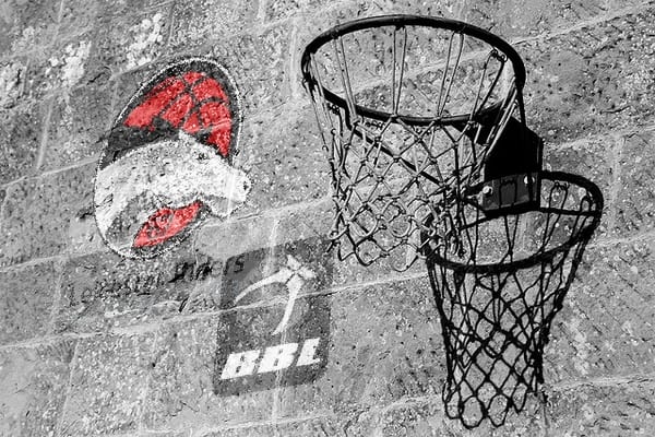
Keeping with tradition, the logo will see the Leicester Riders horse remain as the focal part of the design; however the incredibly detailed version that has been used in previous years has been replaced by a simpler three-tone horse, which sits on the base of a clearer red basketball.
A new element to the design is the inclusion of the number ‘67’, a reference to the year in which the club was established as Loughborough All Stars and crediting the Riders as the oldest professional basketball club in the country.
The words ‘Leicester Riders’ have been removed from the logo altogether, with ‘Leicester Riders Basketball Club’ instead being placed outside of the design area.
A club statement read: “The modern design has been specially crafted to balance both the clubs history and its ambitions to move forward. This is depicted by a strong forward running horse and the introduction of the date the club was founded back in 1967, subsequently lending the Riders the title as the longest running team in the British Basketball League.”
Managing Director Russell Levenston commented: “Following our most successful season to date, we’re extremely excited about the new logo and brand for the Club. We have worked very closely with 5or6 who have done some fantastic work that we hope will make our fans proud.”
As part of the new branding, Leicester Riders will also be re-launching their official website on July 1st, which will coincide with the release of new merchandise bearing the club’s new logo.