Plymouth Raiders unveil new logo
A new British Basketball season brings with it several new things:
New teams, new players and new coaches.
But for the UCP Marjon Plymouth Raiders, as well as bringing new players in the form of Matt Schneck, Colin O’Reilly and Drew Lasker the Raiders have treated themselves to a new logo.
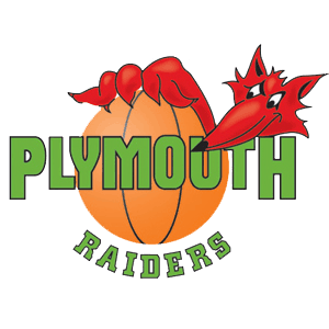
The logo that the Raiders used last season contained an almost dragon-looking Foxy peering from behind the Plymouth Raiders logo:
This has been scrapped in place of a Fantastic Mr Fox-lookalike who features more prominently on the logo:
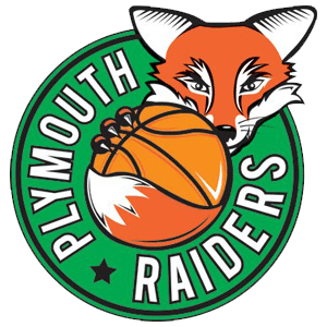
Raiders Chairman Bob Widdecombe told www.bbl.org that he’s delighted with the new logo and it’s new ‘modern’ feel:
“We’ve had the previous logo for some 15 or so years,” said Raiders Chairman Bob Widdecombe. “We wanted to freshen things up a little bit, modernise the logo. We worked with local company Real Fusion who presented us with a few different options, and this is the one that we decided to go with. We’re delighted with it, and everyone that we have spoken to has also been pleased. We’ve had some great feedback from sponsors and I’m sure fans are going to love it. It’s exciting!”
So with a week gone by since it’s unveiling, what do YOU think to the new logo?
Better than the previous one? It is, right?
Tell us your thoughts in the comments section below!